
In the last decade, an enormous cultural shift has taken place in the modern business world which
challenges the traditional work-place norms; conventional working hours, and stiff dress codes.
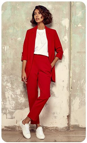
Trainers signify this change and have become the everyday staple footwear in nearly all environments
from offices to nightclubs. In the wake of this, Sans Matin (Without Morning) was born and the
brand strives to embody these ideologies and personify the 'Work Hard, Play Hard' concept.

The Challenge
Sans Matin set out to challenge the rigid boundaries between casual footwear and fashion sneakers. The market tends to separate “everyday trainers” from “dress sneakers,” forcing consumers to choose between comfort and style. The challenge was to create a brand identity that confidently occupied both spaces.


Acquiring the services of a product designer, I quickly managed to get a 3D render of the product that
the client was happy with and we could then move on to exploring colours and textures for the various shoes.


The Audience
The target audience is style-conscious, culturally aware individuals who move fluidly between contexts — from daytime meetings to evening functions, from travel to social occasions. They value versatility and refuse to compartmentalise their wardrobe. This is a consumer who appreciates craftsmanship and innovation but expects their footwear to complement tailoring as easily as it does relaxed streetwear.

Modern consumers don’t live in single categories — so why should their trainers? The insight was that today’s audience wants pieces that adapt to their lifestyle, not the other way around. By positioning Sans Matin as a “smart trainer” — engineered for comfort and wearability, yet refined enough for formal and nightlife settings — the brand could occupy the white space between sport and sophistication. The product was designed to capture what the modern-day consumer is looking for - a versatile, comfortable, and of course, stylish trainer and something that stands out from the crowd.
The brand’s unique horse-hide heel tab certainly does this.


The client had a solid idea and concept of what they wanted in terms of the logo and iconography.
This aided me in fine-tuning their scamps, which were then applied to the 3D renders and packaging.


All the shoes are ethically handmade in Colombia using locally sourced premium leathers, 60% natural rubber soles, and 100% recycled packaging. 2% of all purchases go to Children Change Colombia.
The resulting brand identity reflects this duality: clean, structured, and considered, yet expressive enough to feel contemporary and fashion-forward. Through refined typography, confident spacing, and a premium tonal palette, Sans Matin now communicates versatility without compromise. The cohesive system supports both performance narratives and fashion-led styling — equally at home on the street, at a smart dinner, or on the dance floor.


“No.1 best trainer in the world this week”
